E-Commerce Checkout
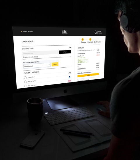
Sports nutrition company Science In Sport had an extensive and long checkout process, potentially deterring customers from completing purchases due to the long process. Therefore, needing to shorten the experience whilst maintaining all key features.
Project Outline
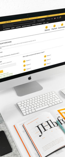
Streamlining the checkout experience for an e-commerce website on both mobile and desktop.
Initial Steps
To kick start the process I had to examine all screens of the existing checkout process and compare those to other checkout experiences of both direct competitors to the brand and also to other general e-commerce websites.
Research
My research for the project included not only benchmarking the current experience against the existing competitors of the business such as Bulk, My Protein and The Protein Works but also companies such as Amazon, ASOS and IKEA.
I also undertook depth interviews and usability testing both in-house and with some external testers in order to ascertain clunky and/or missing features in the process.
Design Process
Moving forward from the research undertaken I then worked with creating hand drawn mock ups of both desktop and mobile screens in order to quickly arrange all the features and to understand the positioning on both formats.
This hand drawn approached allowed me to finalise the number of screens required to contain everything that was required in the experience.
Testing in-house was then redone in order to make sure nothing had been missed when moving from research to design.
Following the digitisation of these screens began, in order to make sure all elements of the design would fit when scaled correctly.
Once all elements had been digitised I then created high fidelity mock ups of the process in order to allow further testing of the checkout experience. This then meant that I could test the flow of the experience both internally and externally. Ironing out any final issues in the concept.
Once testing was completed I was then able to present my outcome to the stakeholders, all before passing the project onto the development team to build and implement the design in to the live site.
The handoff was done via the dev settings of Adobe XD alongside written annotation of any extra features/visuals they might need to consider.
Stoppers
Ultimately, this project had few stoppers to it. The only, real, hurdles were that of the challenge of condensing so many requirements into a much shorter process.
Outcome
Overall, this project was a huge success. The requirement was to reduce the number of screens in the journey and this was accomplished without losing any key features, and even adding a few new features.
During the month after the implementation of the designs the business recorded a huge 34% increase in checkouts that was attributed to the new designs.


